The 2027 Colors of the Year: Our Favorites for Utah Homes
October 6, 2026 • 11 min read
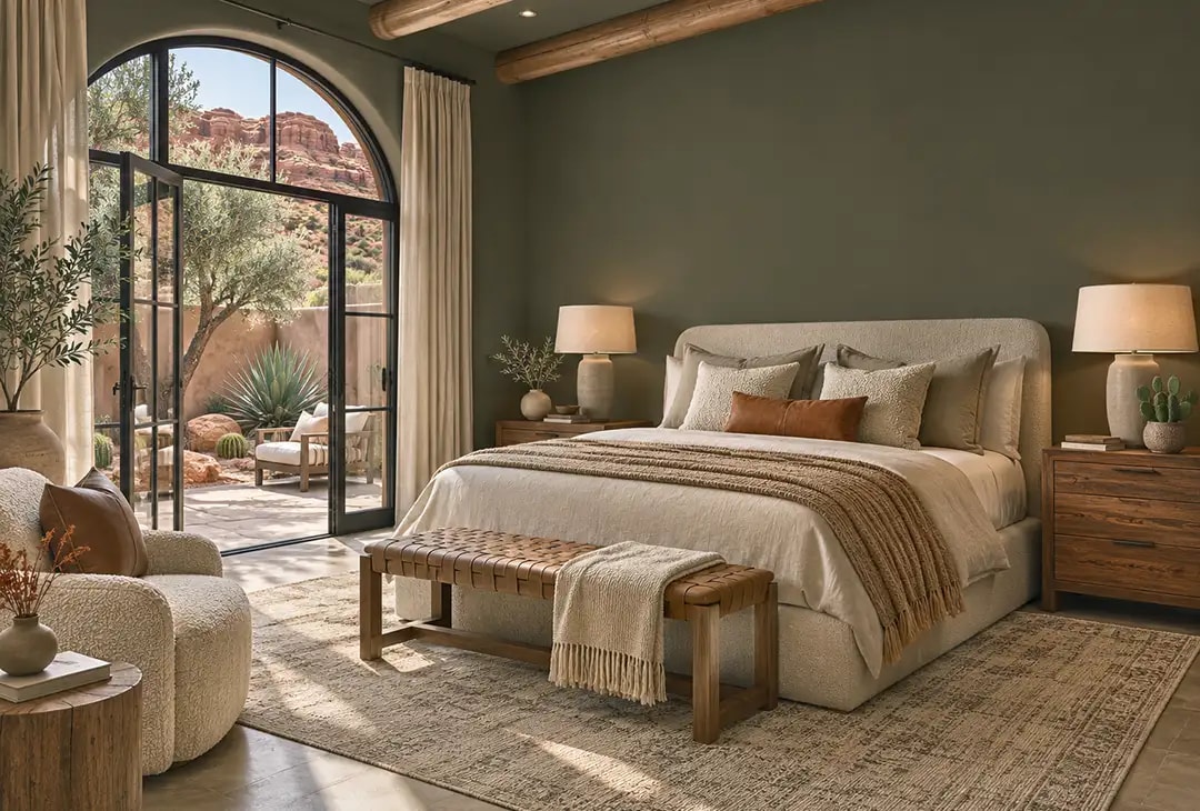
It's our favorite time of the year: the 2027 Paint Colors of the Year are rolling out and, as always, we are refreshing our feeds with excitement with every announcement.
This year's paint colors didn't disappoint. Most of the top paint brands seem to have finally gotten the balance right, giving us color and personality, but in accessible, "I'd actually paint my walls with this" sort of way. I'm looking at you, Raspberry Blush.
For those of you that don't remember, Raspberry Blush was Benjamin Moore's 2023 color of the year and was a vivid coral-red-orange that, while considered by some to be a "refreshing" pop of color, was a many designers and most homeowners just couldn't get on board with. That said, former House & Garden editor-in-chief, Nancy Novgorod, liked the color enough to use a similar (albeit redder) shade in her dining room, which Food Network star Ina Garten later purchased and probably served some delicious meals in, which goes to show some people are just cool enough to own a bright, bold color like that. But for the rest of us? Not so much.
And because half the fun of the paint Colors of the Year (aka COTY) is looking at them online, the same criticism goes to Sherwin-William's 2026 Color of the year "Universal Khaki, which inspires home designers about as much as a universal pair of khakis would inspire a fashion designer. Gorgeous? No. A challenge? At best.
But this year's lineup? Pretty darn good, in my humble opinion.
And as always, you don't have to hunt for any of the paint colors in specialized stores--our Jones Paint & Glass paint stores carry Benjamin Moore, Pittsburgh Paints, and Glidden, and we can color-match every shade in this guide in any paint you choose.
What the 2027 Colors of the Year Have in Common
This year features warm, earthy tones that are easy to live with. Sure, we see some of the typical players like smoky blues, sage greens, and dusty roses, but there seems to be an intentional depth to this year's COTY lineup that is surprisingly pleasing.
The 2027 palette is about warmth, depth, and stability. Nearly every brand reached for nature: moss, soil, clay, coffee, stone, and sky. Even the blues this year are softened and smoky rather than crisp.
Three themes stand out across the announcements:
- Greens are everywhere, but they've moved beyond grayish sage. Benjamin Moore, Behr, and Sherwin-Williams all chose greens. Behr's Grounded has a brown cast, Webster Green is deep and historic, and Celery leans yellow.
- Brown is the new neutral. PPG's Country Soil and Dunn-Edwards' French Press Coffee show how far we've traveled from cool greige. Warm browns forgive wood tones, vintage pieces, and natural materials.
- Blue is softening into a neutral. Valspar's Cottage Door, Glidden's Artifact, and Clark+Kensington's Vantage Point are all muted midtone blues that behave like a backdrop rather than a statement.
The 2027 Color of the Year Lineup
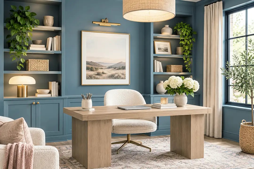
Glidden's Artifact (PPG10-16)
Artifact is a warm, smoky blue from Glidden/Pittsburgh Paints. Glidden's color marketing manager was quoted in Forbes calling it "the perfect 'hit reset color,'" which isn't untrue, but I feel it understates the way this color feels. Since it works well with both warm and cooler wood tones, creams, greens, golds, and whites, it's generally accessible in a range of homes. And while it's a real color instead of a make-a-name-up-for-it hybrid (buh-bye greige), it's
At an LRV of about 20, it's a true midtone. In a Utah Valley bedroom that faces north, it reads as a soft gray-blue. Give it a south or west window and the warmth comes forward by late afternoon.
Outside: Use it on front doors, porch ceilings, and window trim.
Pillows: Blush, ivory bouclé, and oatmeal linen, with a touch of soft sage. Brass accents finish the look. Warm pink softens the gray side of the blue without competing with it, and bouclé gives the room texture so it never reads flat. Rust and butterscotch would make the room heavier and more autumnal than this palette wants.
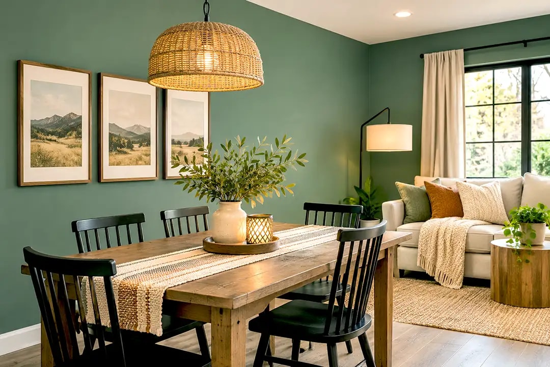
Benjamin Moore Webster Green (HC-130)
Picture a dining room on a January evening, the table set, snow outside, and walls the color of an old library. That's Webster Green. It comes from Benjamin Moore's Historical Color Collection, a set of colors drawn from America's historic landmarks, so it wasn't invented for this year. But that history part of what makes it alluring as a more time-tested color for those searching for a perfect green.
Benjamin Moore built its eight-color Color Trends 2027 palette around it, and the brand points to green's staying power across decades of color trends. Webster Green has a light reflectance value (LRV), the share of light a color bounces back, of about 18 to 20, so it absorbs most of the light in a room. Use it in a study, a dining room, or on kitchen cabinetry, where a cocooning feel is the point.
Outside: It's a handsome front door or shutter color against white or warm gray siding.
Decor: Pull from the palette: copper, burgundy-browns, creamy neutrals, and natural woods look dreamy with this color.
PPG Country Soil (PPG15-30)
[Your Country Soil image] Alt text: "Living room in PPG Country Soil with crisp white trim and rust and olive throw pillows"
Country Soil is the color I'd hand anyone who painted their whole house greige in the 2010s and now finds it cold. PPG describes it as a saturated neutral that blends beige, taupe, and gray with warm, earthy undertones, and it sits at the center of the brand's 2027 "Foundations" theme. It keeps greige's flexibility and adds the depth that makes white trim look crisp and intentional.
If your home has honey-oak trim or cabinets, Country Soil's warmth agrees with the wood instead of fighting it. Use it in living rooms, primary bedrooms, and long hallways.
Outside: Country Soil suits stucco and board-and-batten as a body color, from St. George to Vernal. Pair it with creamy white trim and a dark bronze or black front door.
Pillows: Rust, cognac, cream, and deep olive.
The Rest of the 2027 Colors of the Year
Each paint brand picks its own Color of the Year, so there's no single 2027 color. These are the other major picks announced as of November 2026, and we can match any of them in the paint line you prefer. The common thread is comfort. Nearly every brand reached for moss, soil, clay, coffee, or sky, the blues are smoky rather than crisp, and brown has quietly taken over the job greige used to do.
Behr Grounded (T27-01)
[Your Grounded image] Alt text: "Family room painted Behr Grounded, a mossy olive 2027 Color of the Year, with camel and terracotta pillows"
Grounded is a mossy olive with a brown cast, and it's Behr's 10th Color of the Year. That brown keeps it from reading like the gray-green sages of the last few years. It holds its own as a full-room color in a family room or bedroom, and it's handsome on lower kitchen cabinets under warm white uppers.
Outside: Try it on shutters, a garage door, or trim against a warm cream body. It settles as easily into the Wasatch foothills as it does into the red rock around St. George.
Pillows: Camel, terracotta, oatmeal, and a deep plum for contrast.
Valspar Cottage Door (8004-38E)
[Your Cottage Door image] Alt text: "Bedroom painted Valspar Cottage Door, a dusty blue 2027 Color of the Year, with apricot and camel pillows"
Cottage Door was the first 2027 pick announced. Valspar describes it as a midtone neutral blue with both warm and cool undertones, and in most rooms it reads as a dusty steel blue with a good deal of gray in it. Use it in bedrooms, bathrooms, and home offices, or outside as a body color on a cottage or farmhouse with crisp white trim.
Pillows: Apricot, camel, and warm cream, with a blue-and-cream stripe to tie it together. A gray pillow against this much gray-blue looks flat and muddy. Apricot sits across the color wheel from blue and makes the wall look richer, and camel and warm cream add warmth without the starkness of pure white.
Clark+Kensington Vantage Point (38B-4)
[Your Vantage Point image] Alt text: "Kitchen island painted Clark+Kensington Vantage Point, a midtone blue 2027 Color of the Year"
Vantage Point is a rich, softened midtone blue, sold at Ace Hardware and developed with the trend-forecasting firm Colour Hive. It's a little more saturated than Cottage Door, so it suits living rooms and kitchen islands that get good natural light. Outside, it makes a confident front door or shutter color against white or light gray siding.
Pillows: Caramel leather tones, mustard, and crisp white.
Dunn-Edwards French Press Coffee (DEBN07)
[Your French Press Coffee image] Alt text: "Built-in cabinetry painted Dunn-Edwards French Press Coffee, a deep brown 2027 Color of the Year"
French Press Coffee is a deep brown with a subtle plum undertone, and the plum keeps it from looking flat or muddy. With an LRV around 6, it reads almost black in low light, so start small: a kitchen island, built-ins, trim, or one accent wall in a dining room. Its partner colors are Wilderness (a moss green), Chic Brick (a terracotta), and Ecru Wealth (a linen cream).
Outside: A front door, window frames, or shutters.
Pillows: Ecru, moss green, and terracotta.
C2 Paint Pueblo (C2-510)
[Your Pueblo image] Alt text: "Entryway painted C2 Paint Pueblo, a dusty terracotta-pink 2027 Color of the Year"
Pueblo sits between dusty pink and terracotta, and it moves with the light, reading pinker by day and deeper by evening. It leads C2's "Rural Renaissance" palette alongside Death by Chocolate, Ambrosia, and Element. Use it in entryways, bedrooms, and dining rooms with deep browns, muted greens, and natural materials. On a stucco home in southern Utah, it also makes a warm front door.
Pillows: Chocolate brown, sage, and soft peach.
Graham & Brown Rose Earth
[Your Rose Earth image] Alt text: "Powder room painted Graham & Brown Rose Earth, an earthy pink 2027 Color of the Year"
Rose Earth is an earthy pink with brown undertones, inspired by natural clay pigments, and it debuts alongside the brand's hand-painted floral wallpaper, Roselle Grove. It's a grown-up pink that never turns sugary, at its best in bedrooms, powder rooms, and nurseries. Outside, keep it to a door or a garden shed.
Pillows: Olive, cream, and a floral print.
Sherwin-Williams Celery (SW 6421), and the Swap I'd Make
[Your Celery and Green Tea Leaf image] Alt text: "Swatches of Sherwin-Williams Celery and Pittsburgh Paints Green Tea Leaf side by side"
Celery is a light, fresh yellow-green, chosen jointly by Sherwin-Williams and HGTV Home by Sherwin-Williams. It's too bright and spring-like for most rooms, and it can turn sour in a north-facing room. Utah's long winters give it plenty of gray light to sour in.
I'd reach for Pittsburgh Paints' Green Tea Leaf (PPG1128-5) instead, a muted, sagey green with an LRV of about 31 that holds its color without going dark. It works in kitchens, laundry rooms, and bedrooms, and it's rated for exterior use, where it pairs well with cream trim.
Pillows: Rose, oatmeal, and warm wood-toned stripes.
Dutch Boy Deep Rooted (311-7DB), and the Swap I'd Make
[Your Deep Rooted and Canyon Dusk image] Alt text: "Swatches of Dutch Boy Deep Rooted and Behr Canyon Dusk side by side"
Deep Rooted is a rich, earthy orange that Dutch Boy suggests for walls, doors, or trim. It's too orange for most homes, though, and orange dates a room faster than almost any other color.
Behr's Canyon Dusk (S210-4) gets you the same warmth with more brown in it. It was Behr's own 2021 Color of the Year and still looks current, which is the real test of a trend color. It sits easily with soft taupes and warm creams, and it's handsome on a front door against gray siding.
Pillows: Cream, deep olive, and natural woven textures.
The Easiest Way to Try a 2027 Color Is Paint and Throw Pillows
Your sofa, rug, and dining table are expensive and hard to replace. Paint and pillows are not. When the big pieces are neutral (cream, oatmeal, natural wood, or leather), one new wall color and four or five new pillow covers make the whole room read as new, and when the trend moves on, you repaint and reach for new covers.
Pull your pillow colors from the brand's own companion palette, then add one texture such as bouclé, linen, or velvet so the room feels layered rather than matched. Contrast does more for a room than a perfect match, which is why every color above comes with its own pillow list.
How Utah Light Changes a 2027 Color
The same can of paint looks different in Provo than it does in a showroom photo, and Utah light is the reason. Before you commit to an interior paint color, test it against four things.
- Window direction. North-facing rooms make colors cooler and grayer, so warm picks like Country Soil and Webster Green do well there. South- and west-facing rooms carry cooler blues like Artifact and Cottage Door without turning icy.
- Winter snow. Sunlight bouncing off snow throws a bright, cool light into a room for months. Look at your samples on a snowy morning, not only on a summer afternoon.
- What won't change. Hold swatches against your floors, countertops, cabinets, and any brick or stone. A color that fights your floor will never look right.
- Depth. A color with an LRV under about 20, like Webster Green or French Press Coffee, feels enclosing. That suits a dining room and works against a dim basement hallway.
Paint two-foot squares (or use peel-and-stick samples) on at least two walls, and look at them in the morning, the afternoon, and at night. A front door, a powder room, or a single dresser is a low-risk place to try a deep shade first.
Using 2027 Colors on a Utah Exterior
Utah's high-elevation sun makes exterior color read lighter and brighter than the chip, so most homeowners should choose one step deeper than what looks right in the store. That same sun is hard on paint, so ask for a quality exterior formula for any deep color. Check your HOA rules, look at the color next to your roof and stone, and confirm the shade is available in an exterior paint product. Earthy midtones like Country Soil, Cottage Door, and Green Tea Leaf age gracefully and hide dust better than stark whites, which counts for a lot on a dry, windy lot in Cedar City or St. George.
See the 2027 Colors in Person
A chip on a screen can't tell you how Webster Green will look beside your oak floors or how Artifact will read in your north bedroom. Bring a cabinet door, a pillow, or a photo of your room to your nearest Jones Paint & Glass location, and we'll help you narrow the list to the one that fits your light, then mix it in the paint you prefer. Find a Jones Paint & Glass location near you.
We'll update this guide as more brands announce their 2027 picks.
Author bio (updated, goes at the end of the post): Mikelle Despain has spent 15 years in the paint industry and has written design articles for Jones Paint & Glass for that entire time. A featured Color of the Year guest on the KSL Real Estate Show, cohosted by interior design and real estate specialist Heather Osmond and Jeff Caplan, she covers color trends, interior design, and the latest in windows, glass, and paint for Utah homes. With a background in journalism, she brings a practical, Utah-specific perspective to every home improvement topic she covers.